Kirkland Lake Logos and Branding
Visual Identity That Builds Trust and Reflects Northern Strength
In Kirkland Lake, your logo is more than a graphic—it’s a handshake, a signpost, and your first impression. From Dobie to Evanturel Township, we help local businesses define how they’re seen by customers, investors, and partners through strategic, high-impact branding.
At Web Design North, we specialize in brand design that aligns with your values and local market. Whether you’re revamping an outdated logo or launching a new venture from Swastika, our branding packages create clarity, trust, and cohesion across every medium—from truck wraps to trade show booths.
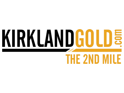
Case Study: Kirkland Gold – A Symbol of Depth and Determination
Client: Kirkland Gold
Challenge
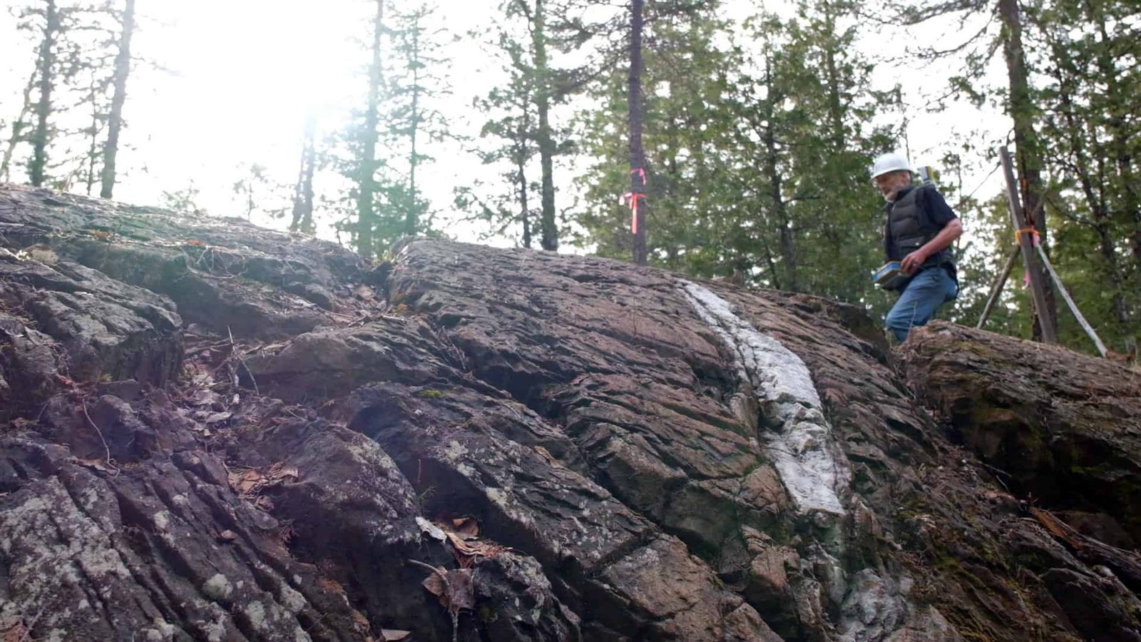
Develop a logo and visual identity that captured the rugged spirit of Northern Ontario exploration while appearing modern, versatile, and investment-ready.
Solution
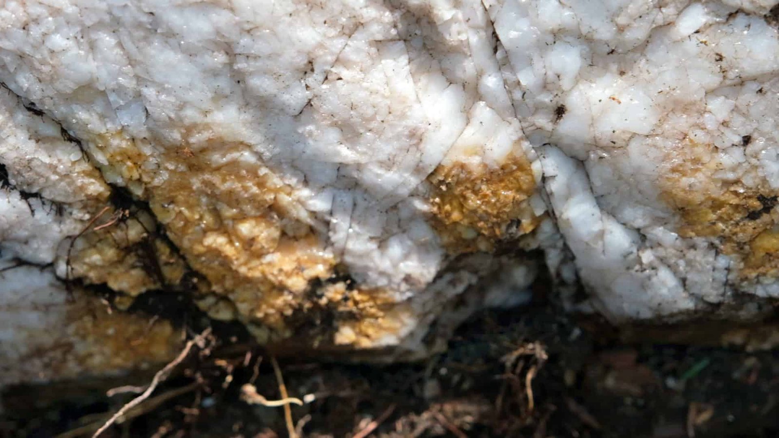
We crafted a clean, scalable logo that referenced “The Second Mile” of gold in Kirkland Lake—signifying the company’s commitment to going deeper and further.
The design performed flawlessly across black-and-white and full-colour applications, from field signage to embroidered gear.
The gold-and-black colour palette evoked strength and heritage while staying visually striking.
Outcome
The logo and brand guidelines became central to investor pitch decks, digital marketing, and merchandise. Within a month of the rebrand and launch, Kirkland Gold secured a sale of the property—proof that strong visuals lead to real outcomes.
What We Include in Your Branding Package
Primary logo design & variations
Font and typography systems
Colour palette development
Brand usage guide (for internal and print use)
Social media-ready assets
Print and embroidery-ready vector files
We design for application and adaptability—your logo should look great on signage in Larder Lake, on embroidered jackets in Boston Creek, and as a favicon on your website.